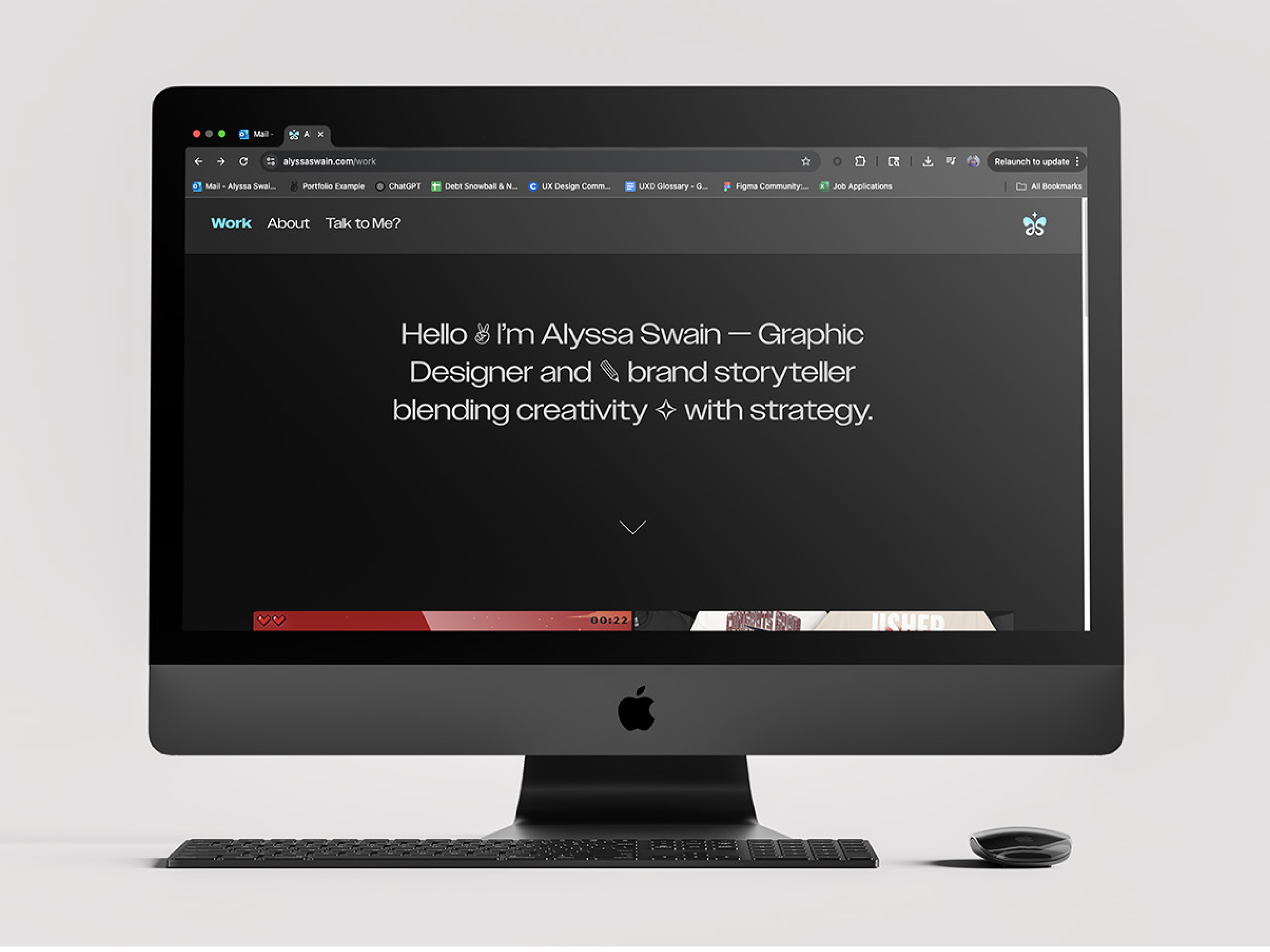
Be Well Physical Therapy & Wellness was founded with the mission of helping people achieve healthier, happier lives through physical therapy and wellness coaching. When my friend — the founder — completed her studies, she came to me with a brand name and a handful of ideas. My role was to shape those ideas into a cohesive identity and digital presence that could carry her vision forward.
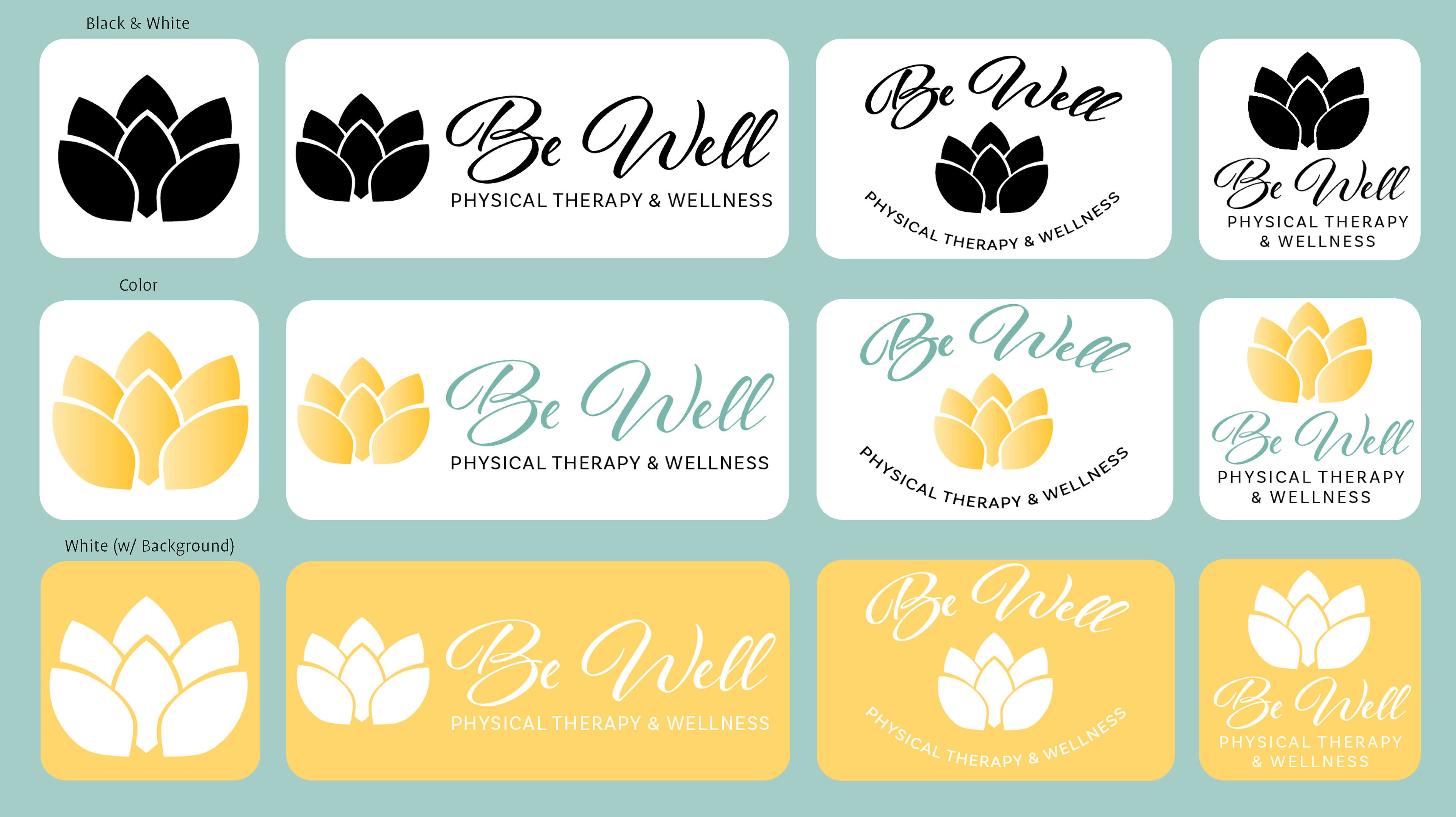
The goal was to design a brand that felt trustworthy, calming, and professional. I built a visual system around a soothing, nature-inspired palette, a lotus flower logo representing growth and renewal, and clean typography that emphasized clarity and balance. Together, these elements created a foundation that could flex across digital and print applications while maintaining consistency.

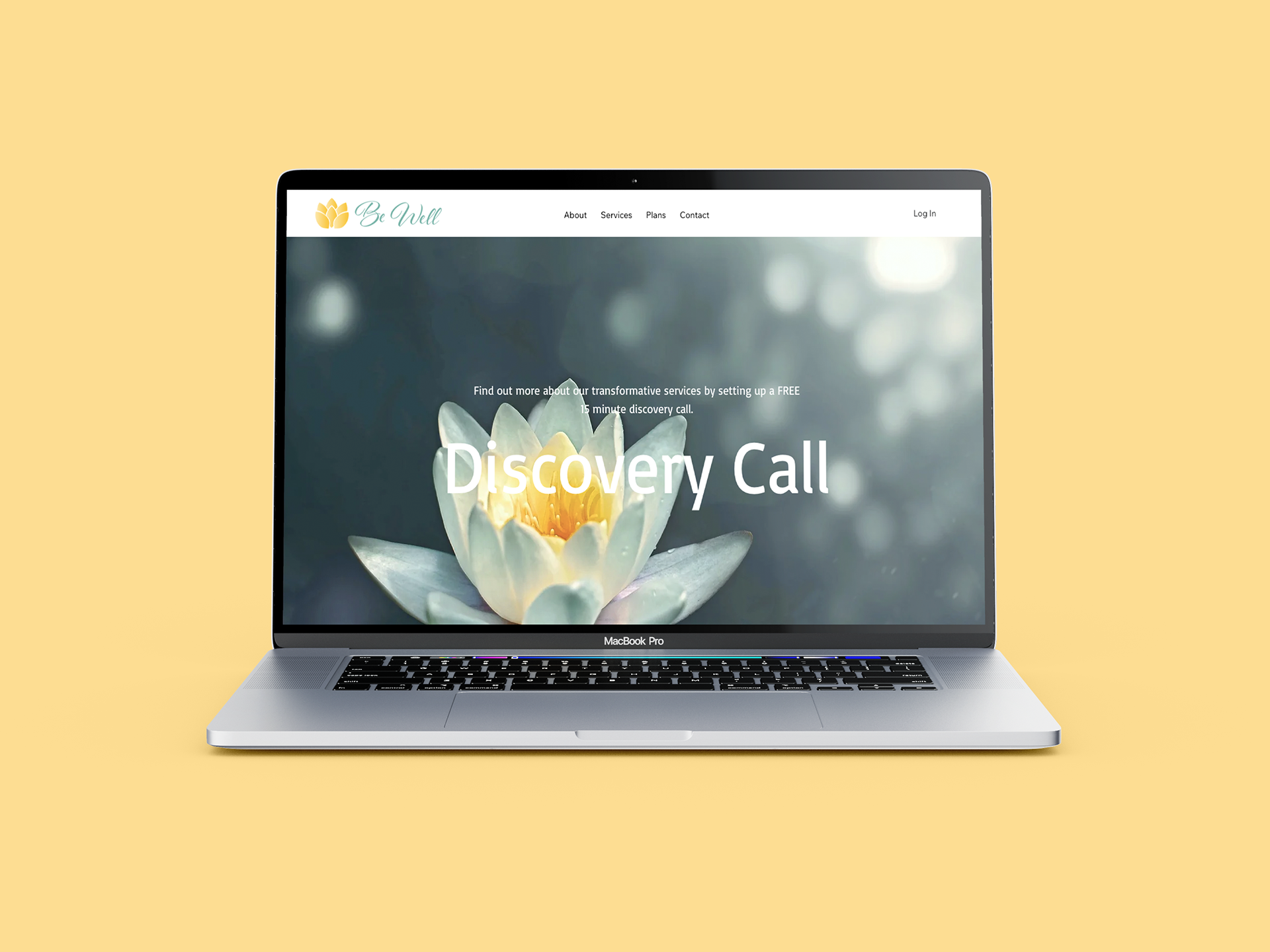
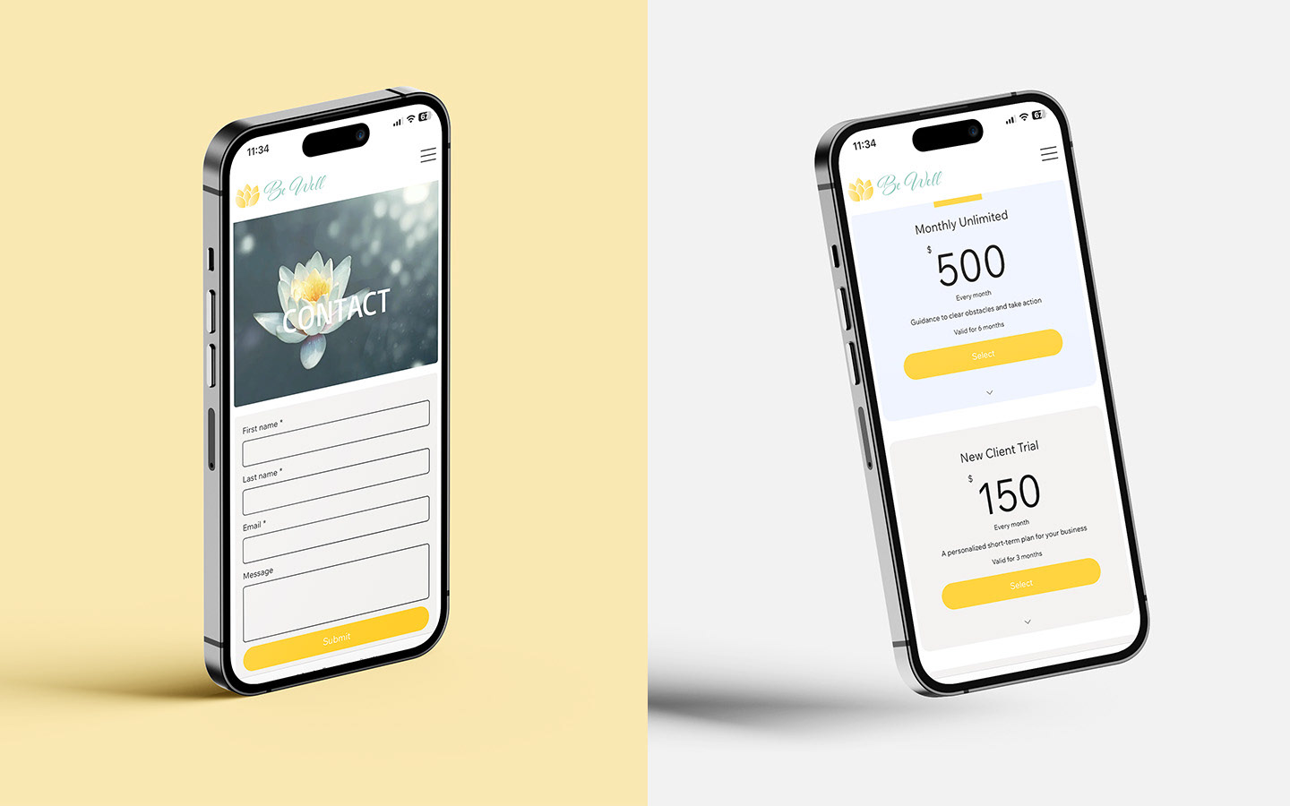
Once the identity was finalized, I extended it into a website that emphasized accessibility and ease of use. With a clean, intuitive layout, the site makes it simple for clients to explore services, book appointments, and access resources. The result is a brand and digital presence that reflects Be Well’s mission — welcoming, supportive, and built to grow alongside the practice.
Role: Brand & Web Designer
Client: Be Well Physical Therapy & Wellness
Tools: Illustrator, Photoshop, WordPress
Year: 2023
Project Type: Brand Identity & Web Design
Applications: Logo Design, Visual Identity System, Website Design
Client: Be Well Physical Therapy & Wellness
Tools: Illustrator, Photoshop, WordPress
Year: 2023
Project Type: Brand Identity & Web Design
Applications: Logo Design, Visual Identity System, Website Design